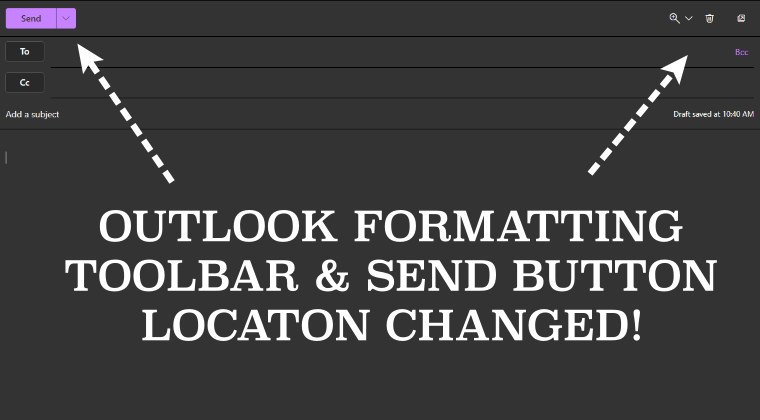
Outlook formatting toolbar & Send button location has now changed
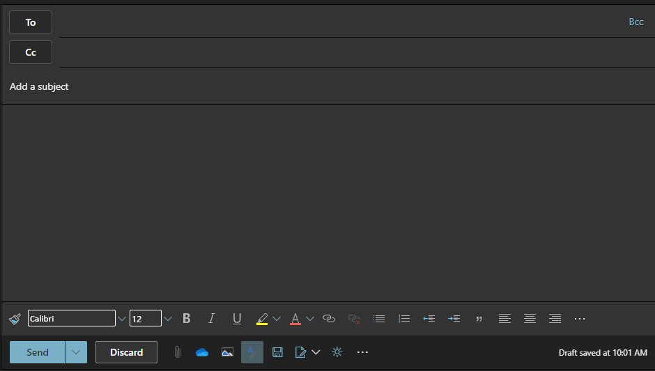
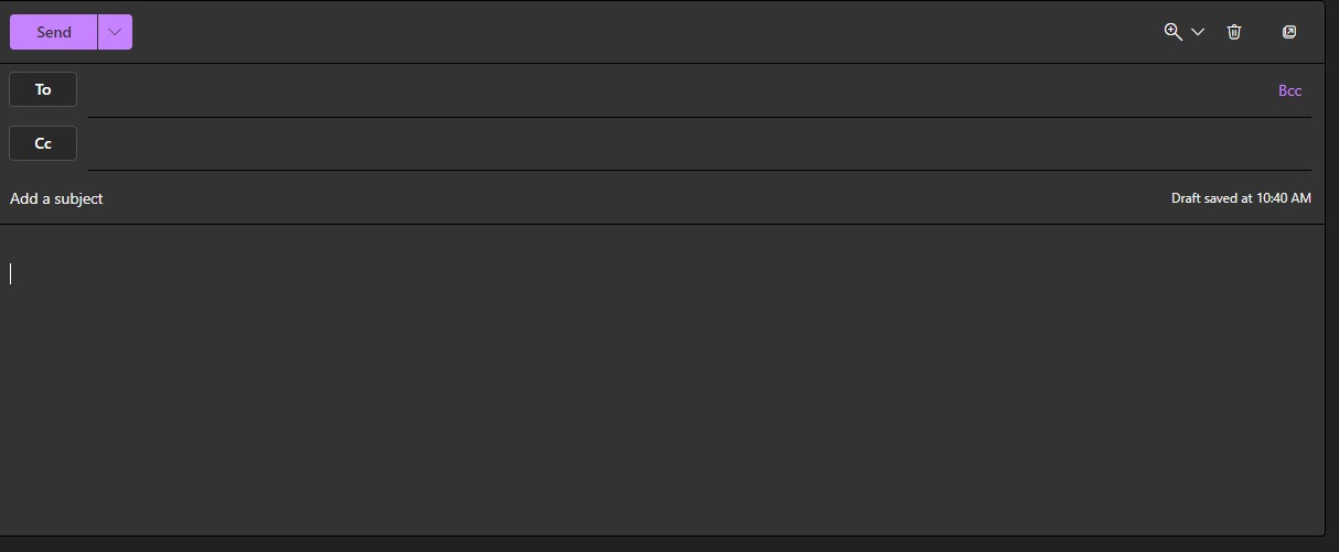
Earlier, the send button was placed at the bottom, below the message body. In the same line, you had the formatting toolbar which houses options like delete, open in a new window, and zoom in. It is proving to be quite a distraction for the end users and ultimately negatively affecting their workflow.
While changes to software or product are nothing new, however, it is usually carried out in the beta build first and then reviews of the beta testers are taken into consideration. If it’s on the positive side, then the feature is subsequently added i the stable build. or the second approach is to directly roll out the update in the stable version but gives the user an option to revert to the legacy build. However, Microsoft didn’t take any of these two routes. It has gone ahead and simply imposed this change, without giving any granular control to its users. The reason for the same is quite simple- because it knows that it has maintained a stronghold in this domain and users have no choice but to accept whatever changes are coming their way. Truth be told, it’s quite difficult now for organizations to leave Outlook and look out for alternatives on account of a few UI tweaks. And Microsoft knows this too, so we are left with no choice but to either adapt for perish. As harsh as it may sound but that is indeed the case. With that said, we would love to hear your opinion on Microsoft changing the location of the formatting toolbar and Send button from the bottom to the top in Outlook. Do have your say in the comments section below.
How to Bypass Outlook Device Admin PolicyWindows Calendar not working in Outlook/Teams [Fixed]How to Change the Location of Outlook PST/OST FilesHow to Switch to Old Classic Outlook View
About Chief Editor


