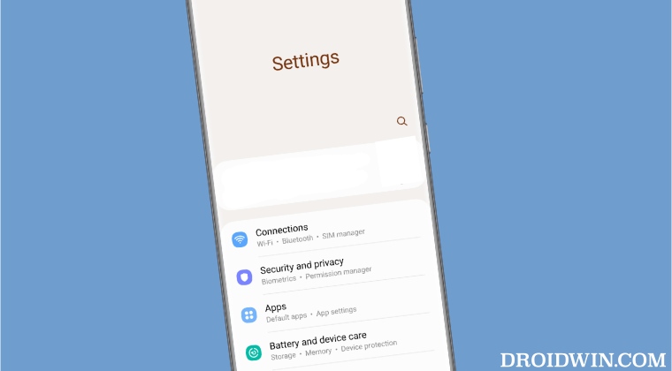
However, there’s just one caveat that some users want to get rid of- the additional unnecessary space at the top of every menu. While this is usually done so that users could easily get access to all the menus on these large screens using just one hand, but there already exists a one-handed mode option for that. Moroever, this excessive space at the bottom only ends up running the entire UI/UX experience for some. If you also echo the same thought process, then this guide will make you aware of a nifty workaround that should help you hide the blank space from the Settings menu on your Samsung One UI. So without further ado, let’s check it out.
How to Hide Blank Space in Settings menu in Samsung One UI
As of now, your best bet is to hide the Accounts section from the Settings menu at the top. While this wouldn’t completely remove the blank space, it will at least remove the accounts section from the top and the unnecessary space will definitely get minimized to an extent. So refer to the below steps to carry out this task: That’s it. This is the only workaround that should help you hide the blank space from the Settings menu in Samsung One UI. While it’s not the best way of getting this job done and neither does it do the job in full essence, but for a non-rooted Samsung device, this is the maximum that we could for. After all, a bird in hand is worth two in the bush!
Assign Google Assistant to Power Button on SamsungMusic Widget UI Bug on Lock Screen in Galaxy S23 Ultra [Fix]Color Palette not working One UI 5.1, notification icon affected toosideActions not working on Samsung Android 13/One UI 5 [Fix]
About Chief Editor

