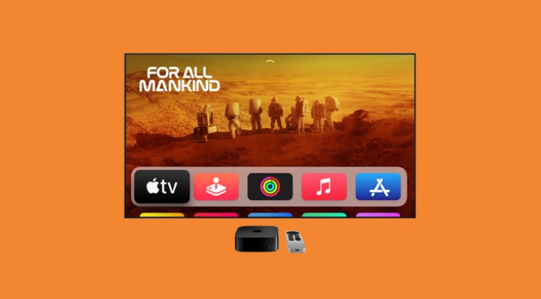
With the tvOS 16.2, Apple has pushed the Up Next section all the way to the bottom of the page, and to make it even worse for the users, they have filled it with a plethora of ads. So first off, you will have to keep on scrolling to the end just to get hold of that section and once you reach there, you will be greeted with tons of ads, all of which end up taking up to 80% of the screen.
Not to mention the fact that all these ads have auto-playing audio so as to guarantee the worst experience. But wait, there’s more. The top section is now filled with random recommendations, most of which might never be in sync with your watch history. All in all, this update has been nothing short of a disaster for the end users. With that said, there does exist a few handy tips that should help you mitigate these issues up to an extent. So without further ado, let’s check them out.
Apple tvOS 16.2 new ‘Up Next’ layout is terrible: Here’s how to ‘fix’ it
It is recommended that you try out each of the below-mentioned workarounds and then see which one spells out success for you. So with that in mind, let’s get started.
FIX 1: Disable AutoPlay Previews
First off, you should consider disabling the autoplay preview feature of Apple TV so as to make the top section “slightly less annoying”. So head over to Accessibility > Motion > Settings and turn off that feature right away.
FIX 2: Tweak the Controls
Some users have opted for setting “TV Button” from “Apple TV App” to “Home Screen” with “Home Screen,” and setting “Top Shelf” to “Up Next” so as to avoid the new Apple TV app as much as possible. You could also give this tweak a try and check if it does any good.
FIX 3: Enable Restrictions
You could also enable restrictions for the TV shows and set the limits at G-rated or TV-Y. Upon doing so, the OS will stop suggesting most of these contents at the top. On the flip side though, your Up Next list might also be limited due to this constraint. So decided on this trade-off accordingly.
FIX 4: Make your voices heard!
It is highly recommended that you file a bug report on the Apple TV hardware form and the Apple TV App form and make the Cupertino giant aware of the dreadful UI/UX tweaks that they have carried out. Likewise, request them to reconsider this change and instead revert to the older interface [how about the subject line: Dear Apple: if it ain’t broke, don’t fix it!]. So these were the three different workarounds that should help you mitigate the new horrific ‘Up Next’ Layout in the Apple tvOS 16.2. As far as the official stance on this matter is concerned, there doesn’t look any optimistic signs that Apple is going to revert this change. As and when [and more importantly, if] that happens, we will update this guide accordingly. In the meantime, the aforementioned workarounds are your best bet.
Plex Audio Sync Issue on Apple TV: How to FixPlex for Apple TV Frame Drops in 4K [Fix]Apple TV Siri Remote not working: How to FixApple TV Remote shortcut not working on iPhone iOS 16 [Fix]
About Chief Editor


